Every page, and what it works out
Each one is drawn from your own artwork. Where a page states a rule, the rule was measured — from the mark you selected, the colours you named, the faces you chose.
Lockups
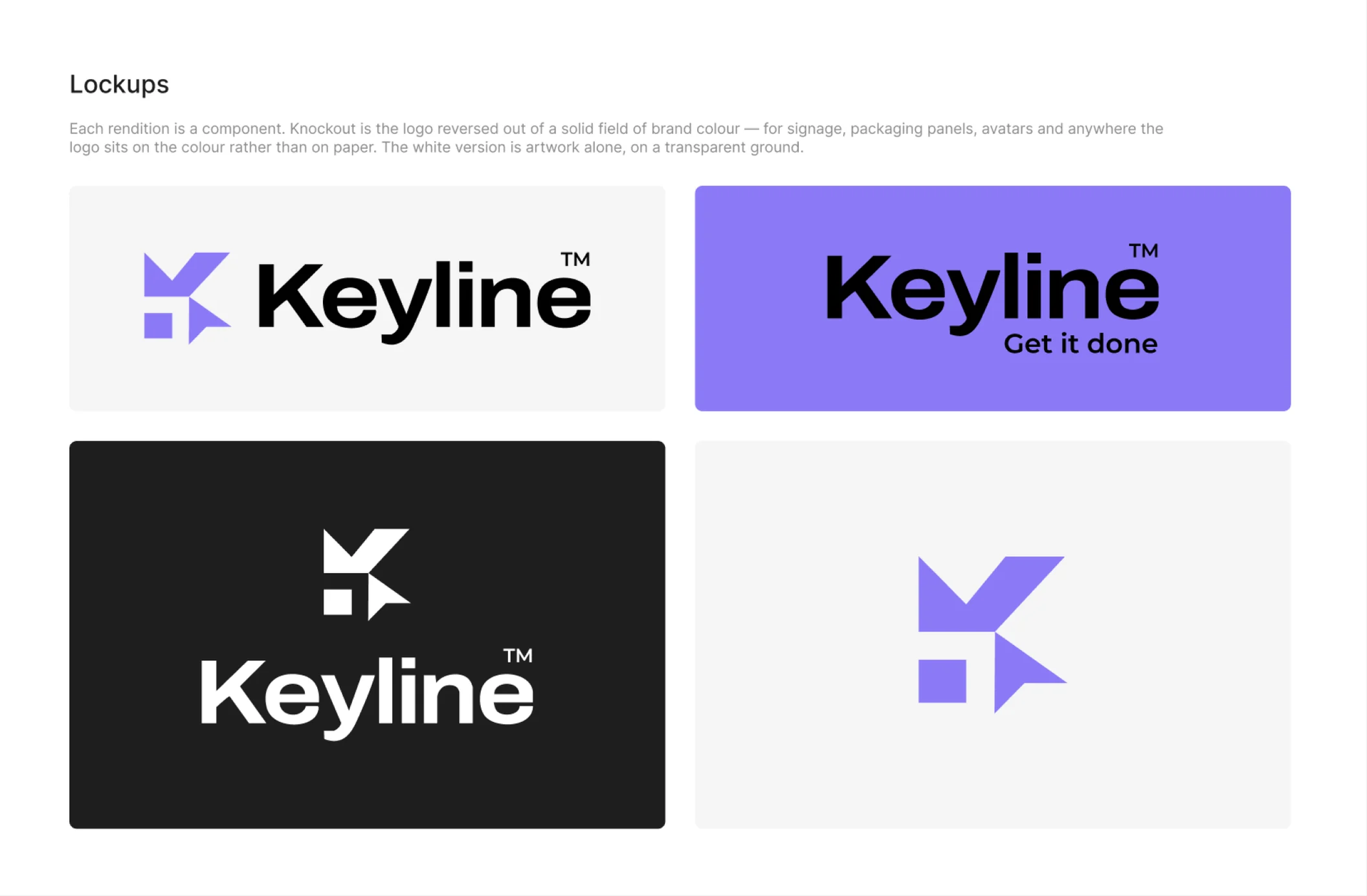
Every arrangement your artwork supports — horizontal, vertical, mark alone, logotype alone, and the same again with a tagline — in every colourway: full colour, one-colour black, one-colour white, and knockout.
Each rendition is a component. Place an instance in a pitch deck or a social template, regenerate the guideline six months later with a revised mark, and the instance follows. That is the difference between a guideline and a folder of pictures.
A rendition may change a colour. It never removes one. A one-colour version of a two-colour mark is the whole mark in one ink, not the mark with a piece missing.
Colour
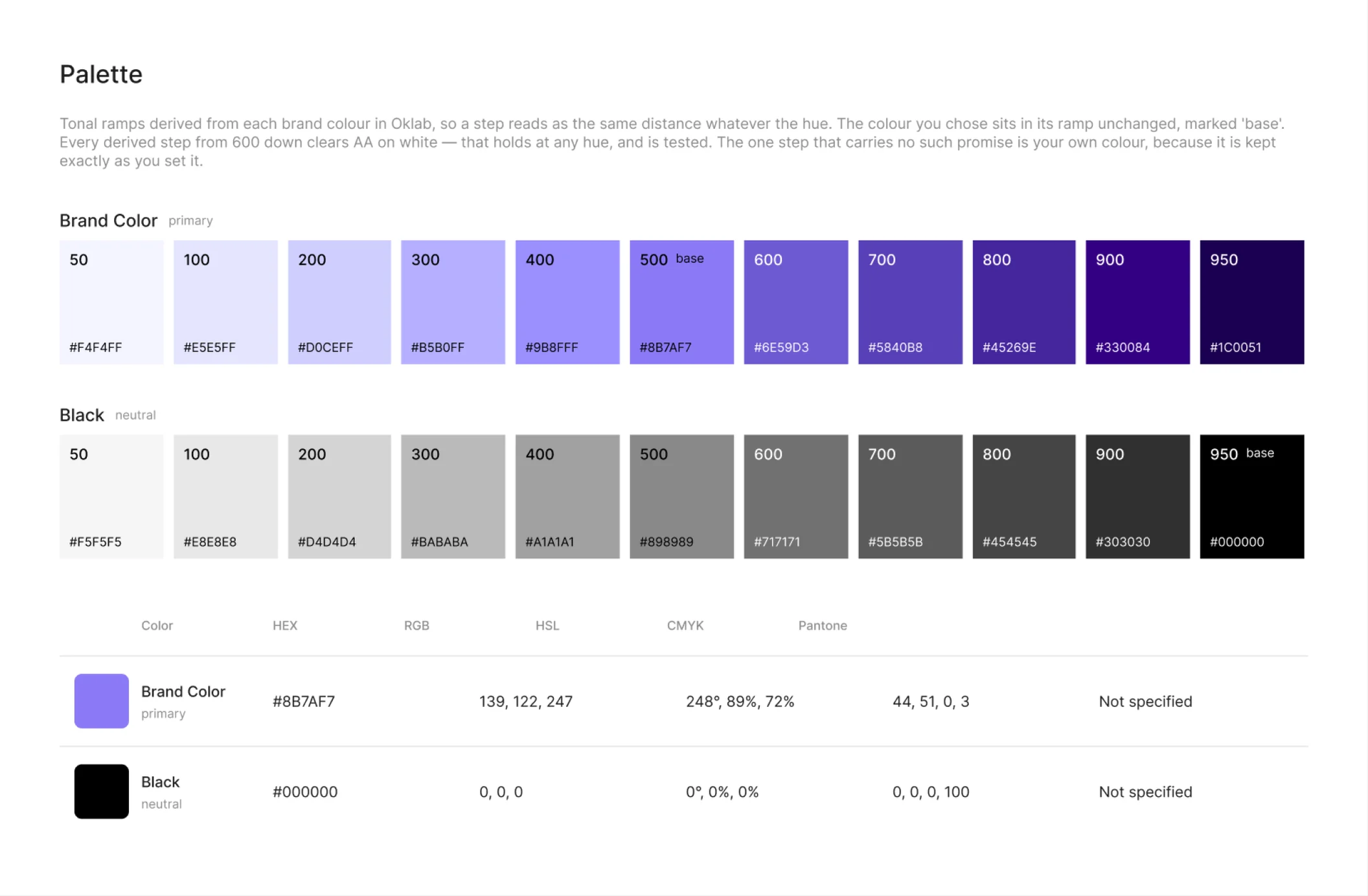
Your palette, with a tonal ramp for each colour computed in Oklab rather than by mixing with white — so a step that reads as one step up actually is one step up, at every point in the ramp.
The same palette is written out in six code formats: CSS custom properties, SCSS, Tailwind, JSON, Swift and Android XML, with names derived from the names you gave, not from positions in a list.
Typography
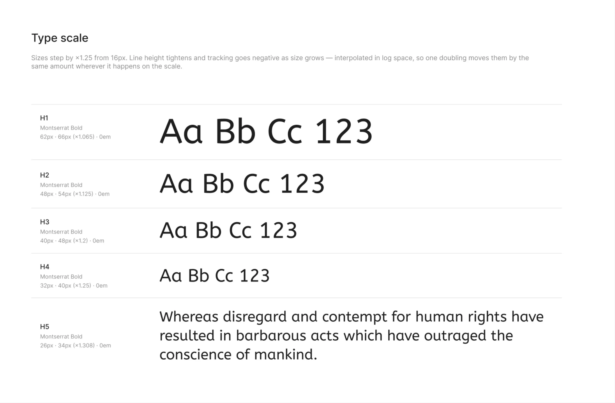
A type scale bound to real Figma text styles, in the same six code formats as the palette. A second scale for a second script, because a Persian and a Latin face are not the same size at the same number, and pretending otherwise is how bilingual brands end up with two different hierarchies.
Document layout
A cover, a contents page, and every generated page arranged in order as a document somebody can read start to finish, rather than a pile of frames in a Figma file.
Clearspace and minimum size
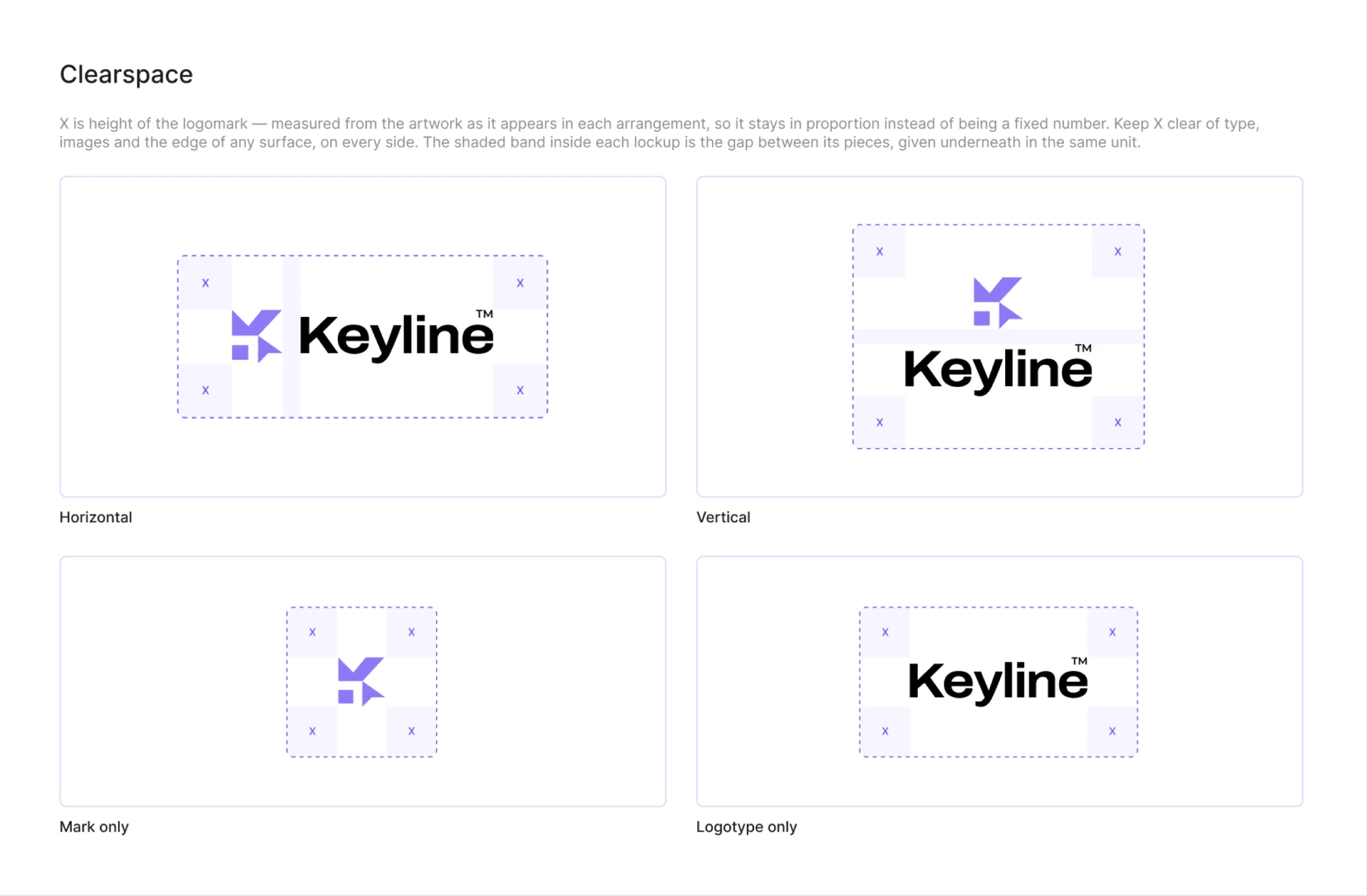
X is the height of the logomark, measured from your artwork as it appears in each arrangement — so clearspace stays in proportion instead of being a number somebody picked and everyone afterwards ignored.
Minimum sizes are given per medium, screen and print, and the page also states which arrangement belongs at which width. A horizontal lockup has a floor below which the logotype stops being legible; the page says where it is and what to use instead.
Contrast matrix
Every colour against every colour, each cell carrying its measured ratio and its WCAG 2.1 verdict — AAA at 7:1, AA at 4.5:1, AA Large at 3:1 for text of 24px or 18.66px bold. The number is computed, printed, and never rounded up to reach a threshold.
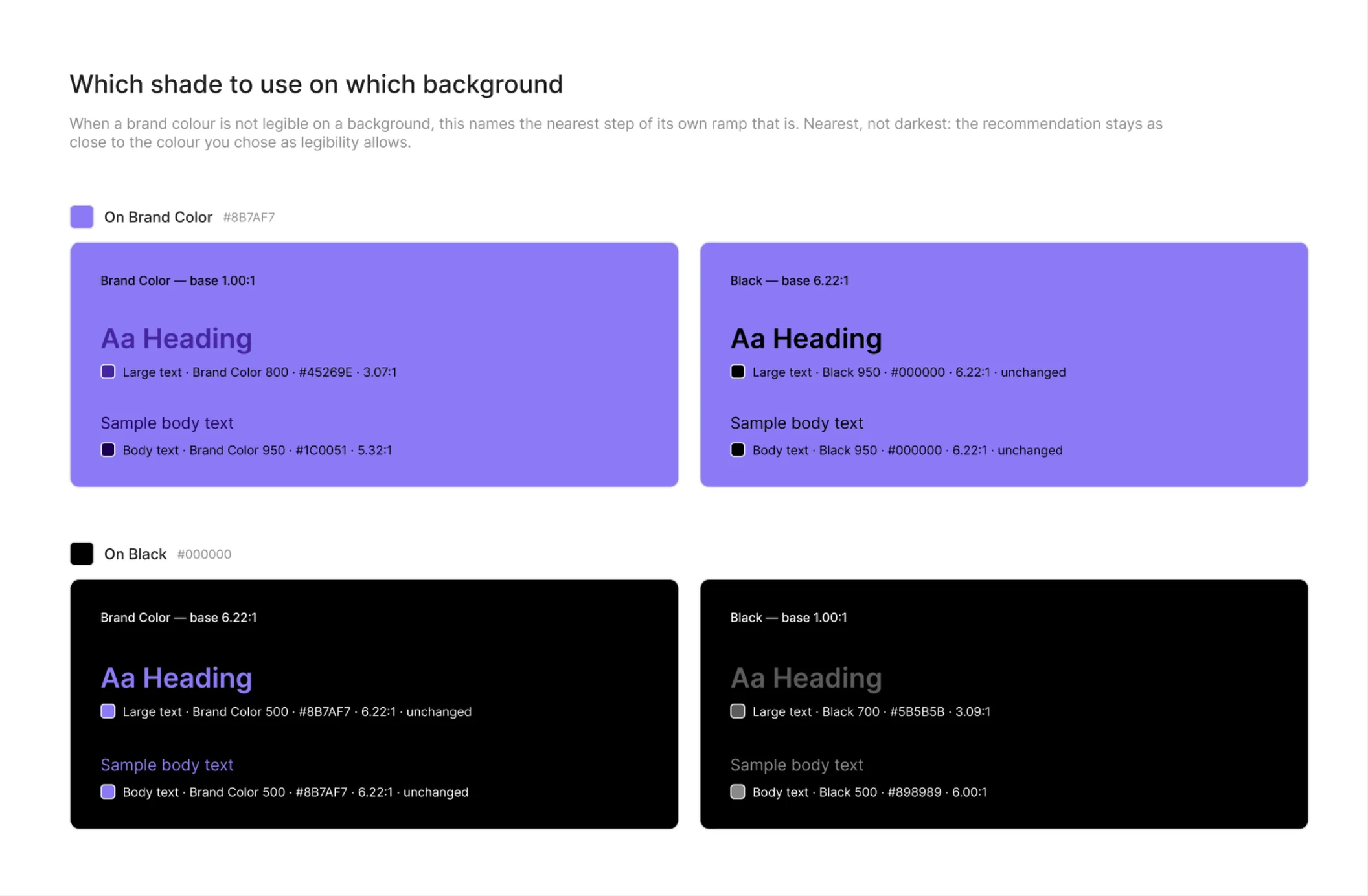
Then the part a matrix alone does not answer: when a brand colour is not legible on a background, which step of its own ramp is. Nearest, not darkest — the recommendation stays as close to the colour you chose as legibility allows, so the page tells you what to use instead of only telling you what fails.
Logo on background
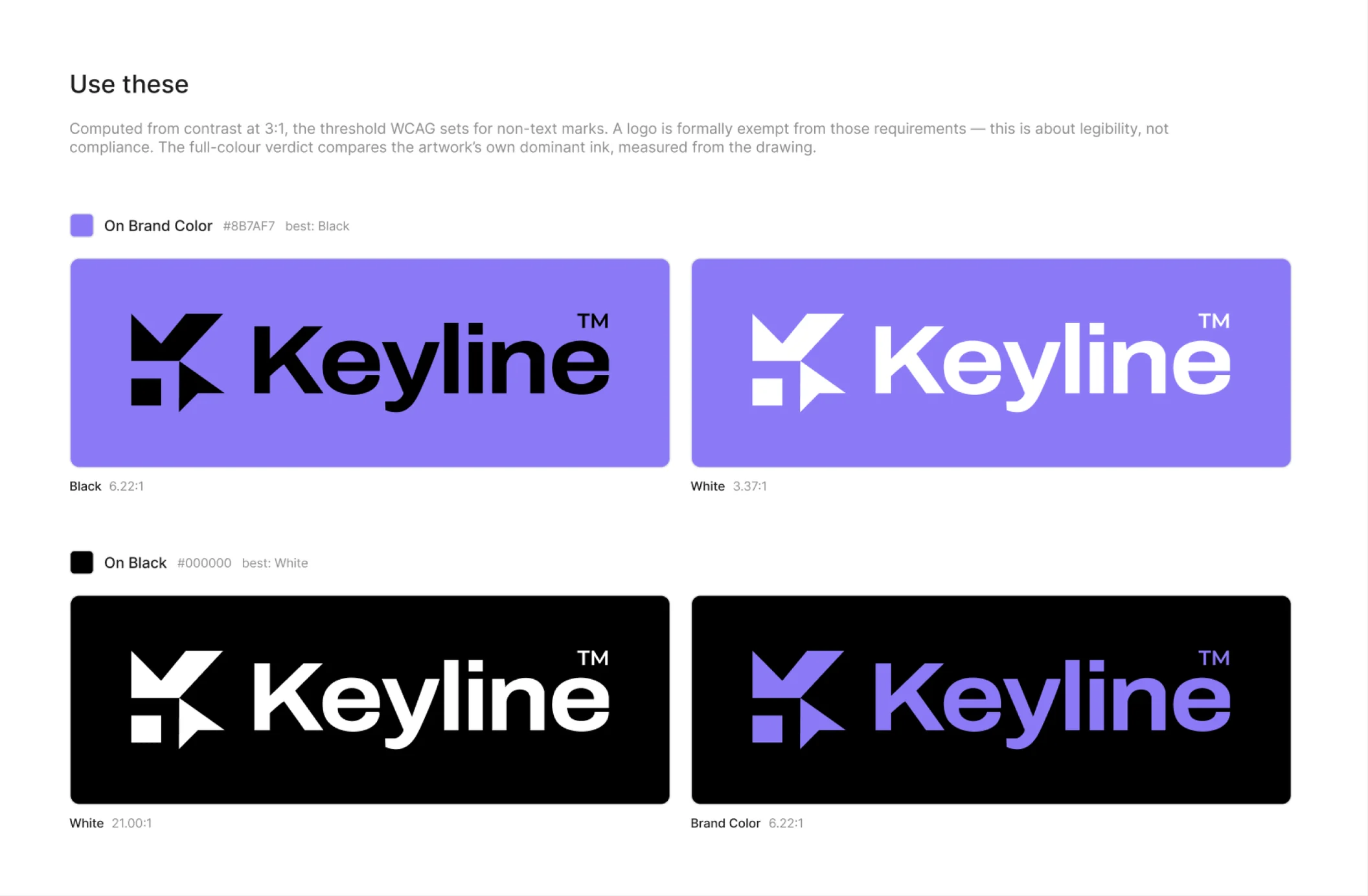
Which colourway each brand background permits, computed from the contrast between the ink and the ground. Plus the rule for a logo over a photograph: the scrim opacity that makes it legible, worked out rather than eyeballed.
Misuse
Eleven violations made from your own logo, each paired with the correct usage beside it. Three of them are measured against your own settings — stretch it past your own minimum size, break your own clearspace — so the page stays true when you change them.
Profile and favicon
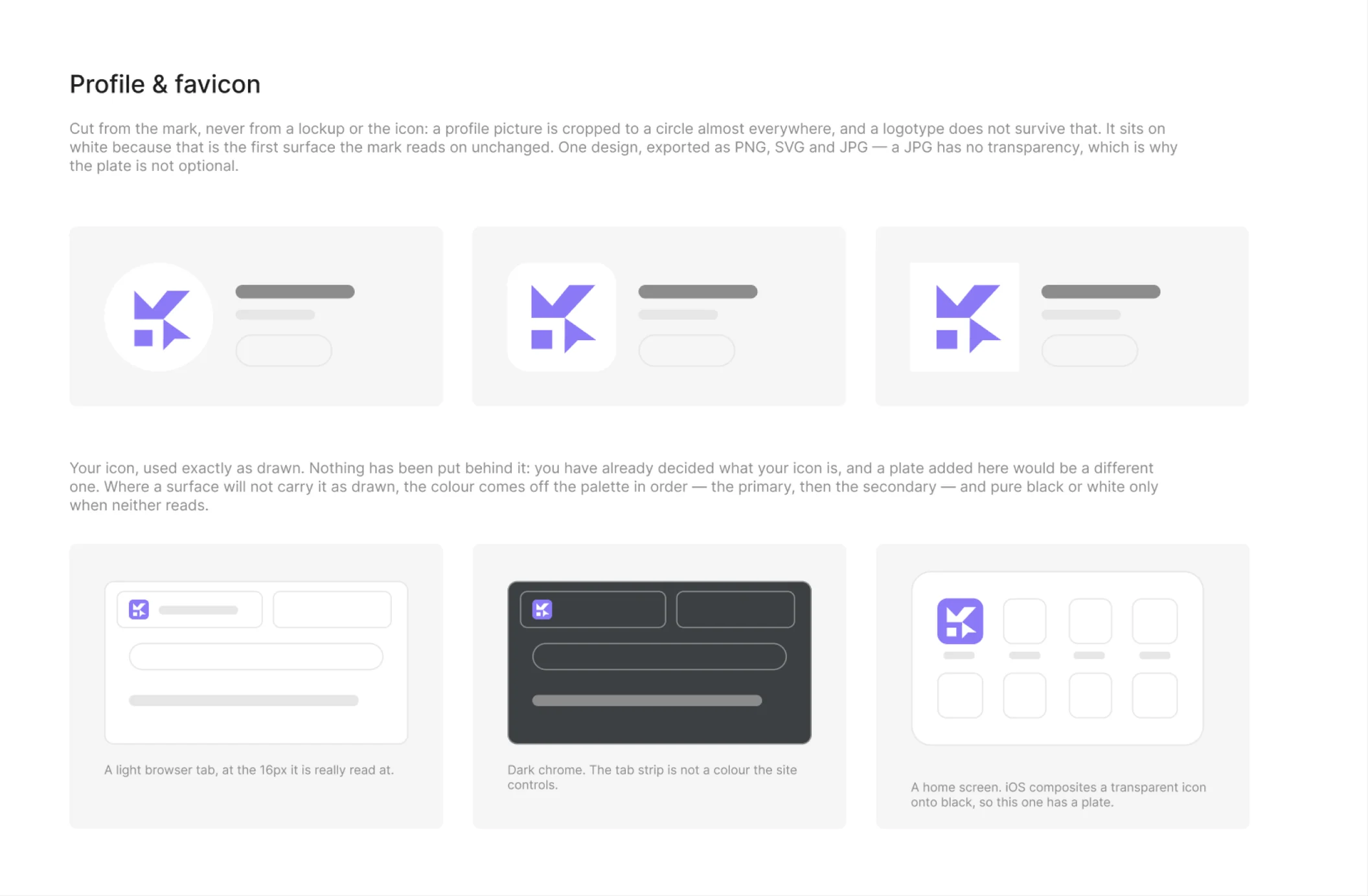
The two squares a logo is forced into, and they are not the same problem. A social avatar is built from the mark, placed in a real wireframe so you can see it survive a round crop. A favicon is the icon you supplied, as drawn, or the mark composed on a plate.
The plate colour is worked out, not chosen: the secondary brand colour, then a shade of a brand colour, and only as a last resort pure black or white. The dark-mode favicon is checked against the actual colour of a dark browser tab, because a favicon that vanishes in dark mode is a favicon nobody sees.
Export bundle
Three to four hundred files in one ZIP: SVG, PNG at three scales, and PDF, split by language, by arrangement and by colourway, with filenames consistent enough to hand to a developer. Favicons in the set browsers actually ask for, a web manifest, social crops, the colour and type tokens in six formats, and a README that repeats the rules for whoever opens the folder next year.
Start with your own brand
Every Figma account gets one complete run — all ten pages and a full export — before deciding anything.